 This article describes the steps taken to build the Google Analytics 4 Traffic Dashboard report with the Analytics Edge Add-in for Excel. It follows the approach described in the article Building a Marketing Dashboard in Excel.
The report is inspired by one I saw online, and thought it would be a good case study to demonstrate the data transformation capabilities of Analytics Edge.
Report Definition
Queries. The first step in the process is to identify the data required. For each report element, I looked at the data needed to populate the display, and this included:
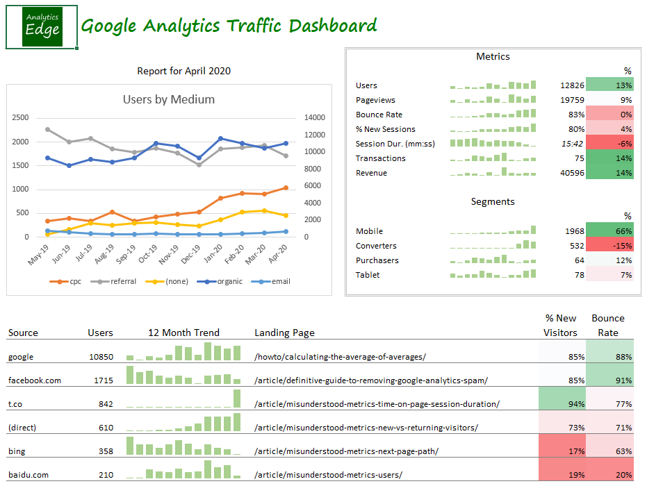
- a chart showing users by month for the top mediums
- sparkline charts showing monthly trends for each of 7 key metrics
- recent month value and delta for each of the 7 key metrics
- sparkline trend, recent month value and delta for each of 4 selected segments
- for each of the top sources, the users and a 12 month trend sparkline
- for each of the top sources, the top landing page with the % new visitors and bounce rate
- a date for the report, show the calendar month being reported
Optimization. The next step is to look for any opportunities to reduce the number of queries by reusing data between design elements. There isn’t any duplication between the sections, but withing each section, the last month and delta calculations could be obtained from the last 2 months of a 12-month export required by the trend charts.
Note that long duration queries could be subject to Google Analytics data sampling if your web property has a lot of traffic. If this is the case, you can enable the Minimize sampling option on the various queries.
Layout. Before we start building the report, we need to think about the layout of the various elements on the page — they are restricted by Excel’s grid design. Since I want the report to be printable (or at least exportable to letter-sized PDF), I spent a bit of time considering elements that were above other elements and I tried to line up metric columns over other metric columns.
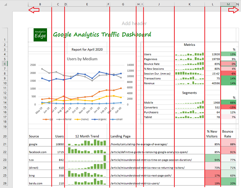
One ‘trick’ I use for to-be-printed reports is to include a 1-pixel wide empty column at the left and right sides of the page. This prevents a problem in Excel where is ‘bleeds’ a little into the next printed page with some printers or PDF exports.
You may notice in the lower table, the Landing Page field spans across several columns. While you might be tempted to merge the cells in this range, I suggest you resist that urge as it is not really necessary — Excel will automatically continue content across the empty cells. Merged cells have a way of causing a lot more work in the future if you want to modify the report.
Building the Report
Download the workbook and follow along: Google-Analytics-Traffic-Dashboard-1-0.xlsx
Use a Data Worksheet. I like to use a data worksheet for dashboard-type reports since it makes it easy to separate the data download work from the layout considerations. You will probably download the data once and change the colour, font and alignment 4 times. Concentrate on getting the data you need first, and worry about how it is presented later.
The Analytics Edge Add-in’s macros let you download the data as well as automate any transformations needed, so you eliminate the need for complicated formulas and intermediate tables, and your report layout effort is greatly simplified.

Documentation. This workbook is pretty simple and it is easy to see what data is used by each dashboard element, but if your report is more complicated, make sure to leave some notes in the data worksheet explaining the purpose of the various blocks, as well as which macro or query generates it. And keep a couple of empty columns and rows between the blocks in case you need to add some data in the future. Don’t put anything below, or to the right of, lists that may grow.
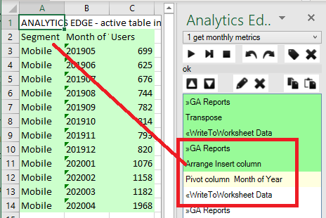
![]() Key Metrics, Transposed. The key metrics table is a simple list, but the data doesn’t come out of Google Analytics exactly like we want it — it is transposed with dates down the rows instead of across the columns. A simple Transpose function fixes that.
Key Metrics, Transposed. The key metrics table is a simple list, but the data doesn’t come out of Google Analytics exactly like we want it — it is transposed with dates down the rows instead of across the columns. A simple Transpose function fixes that.
Labelling Segments. The segment queries do not come with a label identifying which segment it is for, so the macro adds a column with the label, then pivots the date to the columns. This creates a self-labelled block in the data worksheet that is easily changed if you want to change the segment being used in the query.
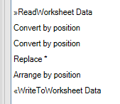 Report Date. To automatically get the data for the report, I used a few extra commands in one of the macros. It reads the last month from a previous query, then uses the Analytics Edge ‘Convert’ function to change the value (‘202004’ format) into a real date, then back into a text string with a different format for display (‘April 2020’).
Top Mediums Chart. The main chart in the report show the top mediums that brought traffic to the site. While you could simply select the top 4 or 5 entries, you have to decide which 4 or 5 to include. The macro uses an algorithm based on the annual total for each medium. It filters the list to include only mediums that had at least 2% of the traffic that the top item had. This keeps the chart from displaying a lot of rows across the bottom axis, which are meaningless.
Since that value (2%) is arbitrary and subject to change, I have put it in the worksheet and the macro reads that value and uses it in the Filter function.

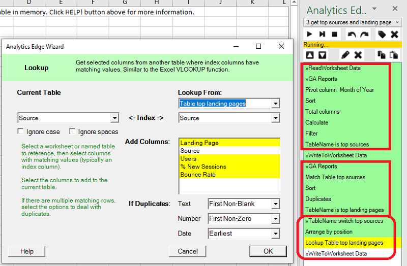
Top Landing Page Per Source Lookup. For the bottom table, a similar approach gets the top sources for the website. A second query gets the traffic by source and landing page, but it sorts and keeps only the top landing page for each source using the Duplicates function. This second table is in a different order, though.
The macro resolves the different ordering by loading the first table and keeping only the source column, then it uses a Lookup function to get the Landing Page data from the second table, appending the Landing Page columns to the existing, in-order, sources. The final result is then written to the data worksheet.
Make It Pretty
Now that I have all the data I needed, I use simple cell references on the report worksheet to the appropriate cells on the data worksheet to populate the tables, and build the charts and sparklines referencing the data worksheet ranges. The delta % cells use simple formulas to get the percentage change in the last 2 months from the data worksheet.
Turn off the grid lines, mute any of the bold design elements (borders, sparkline colours, etc), and let your data stand out. Adjust the font sizes and column widths to make sure the content fits on the page the way you want.
Remember that some metrics like Bounce Rate are considered worse if they are higher, so adjust any conditional formatting you may apply to them (green is good, which is a lower bounce rate).
Try not to spend too much time on this — inevitably the recipient of the report will want changes…
The Sample Report is Yours
The sample report is yours to use as you see fit. Use your logo, or the logo of your client, and modify any of the metrics as needed — I have tried to make it as easy as possible for you to make any changes you may want. If you aren’t sure how to proceed, just send an email to support and I’ll get you going.