Google released new guidance on how to collect and report Core Web Vitals using Google Analytics 4, but the approach makes use of some pretty complicated concepts with BigQuery. In this article, I want to show you how to make similar reports in Excel using Analytics Edge with a lot less work and complexity.
[Analytics Edge Add-in and Google Analytics connector required]
To start with, you need to collect the data into Google Analytics 4. Follow Google’s instructions to add snippets to your site, or you can do as I have and follow Simo Ahava’s excellent instructions for Google Tag Manager.
Set Up Custom Dimensions
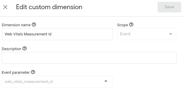
Once you have data flowing into GA4, you also need to add some new Custom Dimensions. Simo’s instructions create three new event parameters for web vitals measurement (for web_vitals_easurement_id, …name, and …value), but you can’t include new event parameters in a report unless you define a matching custom dimension, so do that now!
After a few days collecting data, you can start building a few reports.
Base Query
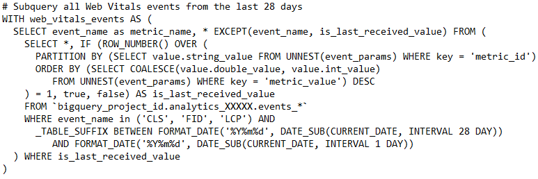 The Google article’s analysis is based on a pretty advanced chunk of BigQuery code that pulls the detail of the Core Web Vitals measurements by id value.
With Analytics Edge, we can easily reproduce this query with a simple data pull: date, event name, and the web vitals measurement id with the event value.
Of course, you would add a filter for the event names of ‘LCP’, ‘FID’ or ‘CLS’, plus select the date range of interest. Analytics Edge pulls all your data from the API into Excel and your analysis begins!
Sample Reports
Google’s article provides several example queries, a couple of which I have recreated here using Analytics Edge, just to give you a taste of what you can do in a few minutes.
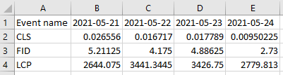
Seventy-fifth percentile across the whole site
The first is LCP, FID, and CLS at the 75% percentile across the whole site. This analysis uses a new feature introduced in v10 of the Add-in – the P75 aggregation which is the 75th percentile value; the value at which 75% of the events reach.
With the base query results, we use the Pivot function to pivot the event name by date, and get the P75 aggregate of the event value.

That was it! The results are ready for charting.
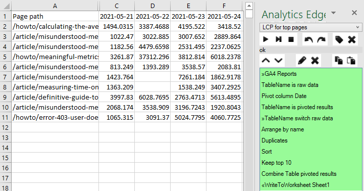
LCP scores (p75) of the 10 most popular pages
This report requires the addition of the Page dimension to our base query, and change the filter to keep only the LCP event name. It will also require a 2-step analysis — first figuring out which pages are the top 10 pages, then getting the LCP scores for those pages.
With the extra Page dimension, we pull a lot of data, and we want to use it for 2 purposes, so the first step of our Analytics Edge macro is to hold a copy of the raw data from the query in memory. We do that with a Table Name function simply by assigning a name that we can reference later.

Then we repeat a Pivot function similar to the previous example to get our daily LCP p75 values by page. This list includes all of the pages, and they are not in any specific order, so we will hold this table in memory using Table Name again (‘pivoted results’).
Now we need the list of top 10 pages, so we switch back to the ‘raw data’ table, and use Arrange to drop all the columns except the Page path. To get a simple count of the number of events per page, we use the Duplicates function, adding a Count column. At this point it is a simple matter to Sort by the count column and using the Top/Bottom function to keep the top 10.
The final step is to Combine the pivoted data with the top 10 list, and the Combine function does this easily, adding new columns from matching rows of the pivoted results to the top 10 page listing.

That gives us all the data we need for the report, easily refreshed by running the macro. Note that there was nothing complicated in the process, and the steps are easily changed to suit unique reporting needs for your website or application.
Here are the results and the whole macro used to create them:
Core Web Vitals Reporting — Simplified
These are just a couple of examples, but you can see that reporting Core Web Vitals for your website don’t have to be complicated and don’t require a massive investment of time and brain power learning BigQuery.
Analytics Edge leverages the Google Analytics API to extract your data into Excel, and the wizard-based macro capability of the Analytics Edge Add-in makes reporting as easy as it should be. No programming required.
The Analytics Edge Add-in and Google Analytics connector are free for 30 days without a credit card. Simple Excel report automation – time and cost effective for even the smallest business.