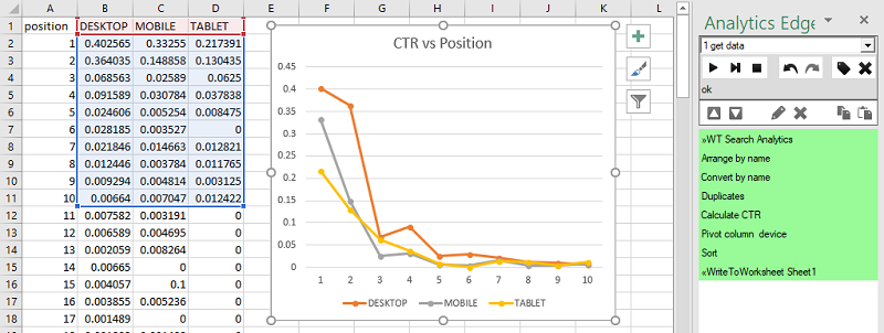
The Analytics Edge Add-in is perfect for doing a quick analysis of search engine ranking data. In this article, I show how to get a CTR versus Position chart by Devices — showing the difference for click-thorough-rate of desktop versus mobile.
The Approach
The data is downloaded through the Google Search connector, then transformed by several simple steps to generate a table of CTR values, by position and device. Because the API does not provide a distribution report, we need to do the work ourselves, downloading all of the query terms by device and calculating the distribution of CTR by position.

The position data is available as a long decimal number, and it needs to be averaged into a whole number. The CTR numbers need to be calculated for each device-position combination. Then we need to pivot by the device to generate a table we can use for a chart.
None of this is really complicated, and it only involves a few steps, so it only takes a couple of minutes with Analytics Edge.
Average CTR Required
Note that you can’t just average the CTR ratios — that is bad math — we should use a ‘weighted average’. This is because a CTR of 0.4 with 1000 impressions should have more effect on the average (more ‘weight’) than a CTR of .0001 with 2 impressions. To get a proper average, you just add up all the clicks and all the impressions, then calculate the CTR using the totals.
CTR = (sum of clicks) / (sum of impressions) for each device-position combination
The Query
Getting the data is easy with the Google Search connector — just add the device and query dimensions, pick a date range to use, and finish the query.

Drop Unnecessary Columns
While not really necessary, it is a good practice to drop unneeded columns from the analysis to reduce the memory requirement and speed up processing. In this case, we don’t need the query column or the original CTR column (we will recalculate CTR from clicks and impressions), so we can use the Table>Arrange wizard to keep only the columns we need.

Averaging the Position to a Whole Number
The next step is to round the position numbers to whole numbers, and that is easily done with the Column > Convert wizard. Pick the ‘position’ column and, on the Number->Number tab, select to round the number (0 decimals).

Combine Duplicate Position-Device Rows
Using the Table>Duplicates wizard, we can now combine the rows with common position and device values, summing the clicks and impressions. We now have the total number of clicks and impressions for each combination of device and position.

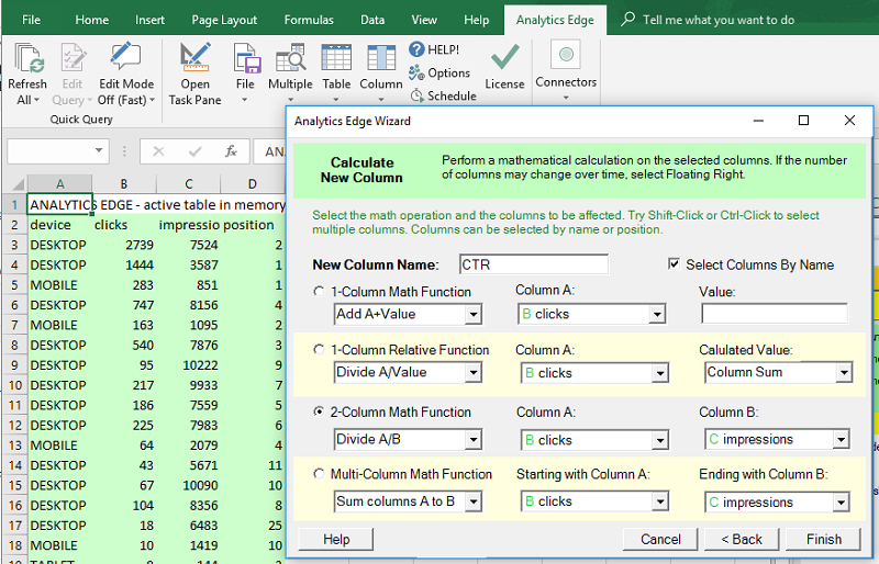
Calculate CTR
Using the Column>Calculate wizard, we can add a new CTR column that simply shows the clicks divided by the impressions (a 2-column math function).
Pivot Devices to the Columns
To prepare for charting, we use the Table > Pivot wizard to pivot the devices to the columns, keeping the position in the rows and the new CTR column as the values.

Sort and Write to Worksheet
As the final steps in the macro, we Sort the results by position, in ascending order [optionally we could also arrange the columns in alphabetical order], and use the File > Write to Worksheet wizard to put our results into the workbook.
Add a simple Excel chart and you have a completed analysis, finished in a few minutes.
Download a sample workbook (you need to edit the first query function to use your website):
CTR-vs-Position-by-Device.xlsx
Where Can You Go From Here?
Since that didn’t take very long, you have plenty of time to extend your analysis — look at other websites you have access to. Include a filter in the query to see how unbranded searches differ. Instead of looking at the differences by device, try it by country. Or use the Google Search connector’s multi-query capability and see how the profile changes over time.
It is all possible in a couple of minutes using the same techniques…and Analytics Edge.
