If you are trying to build a Google Analytics report comparing one year to the previous one, you can use the Pivot operation to make charting easier. The trick is to choose your dimensions wisely.
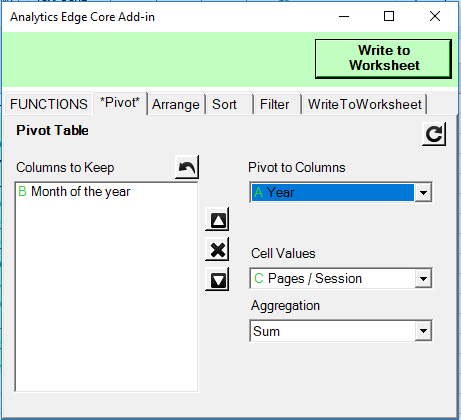
In this example, I will build a query with the Year and Month of the year dimensions. It is important to have the Year separate so it can be pivoted, and use the Month of the year because it does not have any year-component — Jan 2017 is month ’01’ and Jan 2018 is also month ’01’.

Then we pivot the Year dimension to the columns. You can use the Function wizard for this [Add-in Quick Query], or use the Pivot function in a Add-in macro.
Writing the results into Excel, we get a nicely formatted table suitable for graphing with 2 data series.

If we wanted a second metric on the same graph, you can place a second query right beside the first. After pivoting by Year, we can drop the Month of the year column using the Function wizard’s arrange tab (or an Arrange function in a macro). This avoids having a duplicated Month column in the middle of our results.

Finally, we can add a columns of month names to the left of our results for use by the graph axis labels. The rest is Excel graphing options; pick a Custom Combination chart type, with one metric using bars and the other using lines.

When you refresh, Analytics Edge will clear the queries and repopulate them, but the month column to the left will remain untouched.