Creating a dashboard KPI/metric card or widget in Excel can be quite simple — it’s really just a matter of downloading the right data and some easy formatting techniques. Layout is your challenge, but even that can be overcome. This article discusses 3 ways to build a widget for your Excel report.
Building a Widget
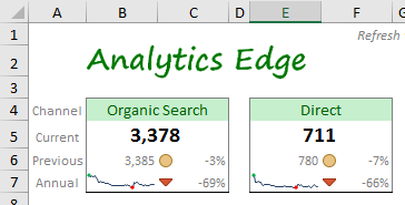
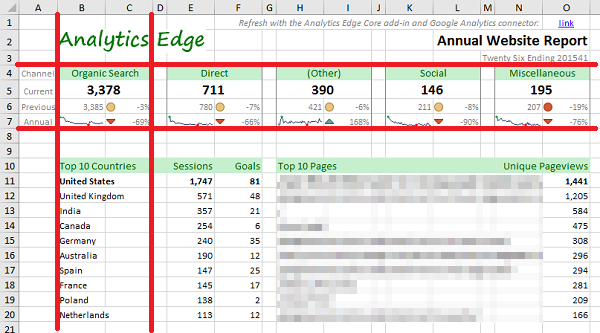
The classic dashboard widget includes a title and a main metric, sometimes referred to as a key performance indicator (KPI). Since context is critical for any report, the number is usually presented with a comparison to the previous period, usually as a percentage change.
Sometimes you include the previous period’s value as well. To provide even more context, a year-over-year percentage change number could be included, or even a small annual trend curve (sparkline). Some conditional formatting could add an up/down indicator or color change.
That is a lot of information packed into a small space, so before you add everything, consider the purpose of your report and the level of detail you feel is appropriate. Less might be better.
The Data Behind the Widget
Reviewing each element in the widget, we see that we need the following data elements:
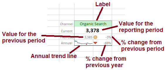
- a value for the current period (top number displayed)
- a value for the previous period (displayed as a number and used to calculate the % change)
- values for each of the periods over the past year (shown as an annual trend line)
- a value for the same period in the previous year (used to calculate the % change)
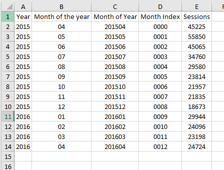
This means we would need to get 13 months of data in monthly buckets. Using Analytics Edge connectors, we can automate the download of the data from various sources, but a word of caution — do not just pull the ‘Month of the year’ number since 2015-12-01 is before 2016-01-01, even though month 12 is after month 1.
Formulas
The next step is to tie the widget elements back to the data using some simple Excel formulas. The current and previous period measures are simple cell references. The percentage change calculations follow the formula of =(current value-previous value)/(previous value). You can use a simple sparkline chart for the trend curve linked to the data.
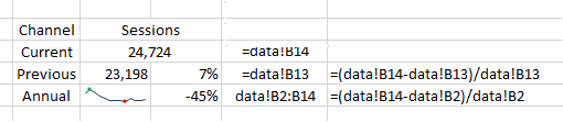
This example assumes the monthly metrics are in a column, cells B2 thru B14.
Presentation Tricks
Of course, you can’t send your boss some plain old black numbers on a white grid. A little bit of Excel formatting ‘magic’ will make things much more presentable to others. Here are the things I typically do:
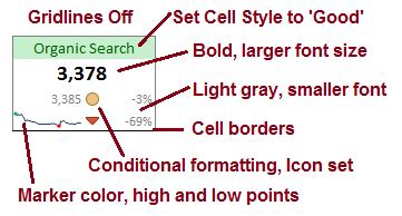
- first, turn off the gridlines to give the dashboard a cleaner look
- use simple Excel Cell Styles to change title background and font colors, or choose your own colors to match your corporate color palette
- make the current period number stand out (larger, bold) and de-emphasize the other numbers (smaller, light gray)
- put a border around your widget to visually group all the elements as related items
- add conditional formatting on the percentage change numbers for visual reinforcement of the direction of change (note: change the thresholds to above/near/below zero)
- add high and low points to the sparkline charts to make it easier to determine where they might be on those tiny lines
Formatting your dashboard can be extremely time consuming if you let it. It is easier/faster to do all of the formatting at once, so get all your elements in place first, then format the whole worksheet. I have found over the years that it helps to review your draft report unformatted if possible (or at least all in black and white) to avoid wasting time discussing colors and font sizes, and keep the discussion on the metrics themselves. Once you have all the elements you want, you can then decide how to format it and what you want to emphasize.
Consider the ‘story’ you want to tell with the report — too many reports simply show data without purpose, and those reports have little value to the recipient. Make sure the formatting emphasizes the message you want to send.
Widget Approach #1: Cell Formatting
This approach simply puts widget elements in cells that have been sized and formatted to appear like a widget as described above. Because it requires specific cell heights and widths, you need to plan out your entire report to make it possible. The article Building a Marketing Dashboard explains this approach of pre-planning where various design elements will go.
For example, if we wanted a row of widgets across the top of the report, it would force certain column widths on the lower section of the report. This is less of a problem if there are no tables…just charts.
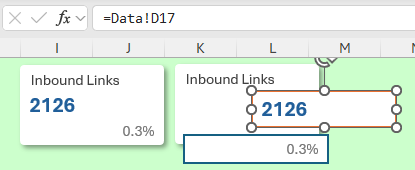
Widget Approach #2: Paste > Linked Picture
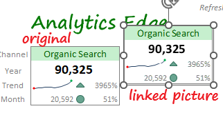 Did you know that you can select a cell or group of cells, copy them, then select Paste > Linked Picture to create an image of the selected cells? When you do this, the image is probably sitting on top of the cells you copied, so just drag it to the side and you will see the linked image. Note that the image background may be transparent.
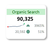
The image is commonly placed over a rounded rectangle shape to provide a border. You may find it looks best with a white background, no outline, and a slight shadow effect. Note that any change to the original cells will appear in the linked-picture, including widths, colors and font sizes. Resizing the linked-picture can distort the image.
Widget Approach #3: Shapes and Text Boxes
A third approach is faster to create but less capable: using a base shape with text boxes. Start with a rounded box shape (white/no outline/shadow). Then overlay a couple of text boxes. Each of the three elements can use a cell reference for the text/numbers to be displayed (do not type it in the box — select the box and enter it in the formula bar).
I suggest that you group the three elements (see the Shape Format tab). This allows you to move them around to align with other elements on the report page.
The problem with this approach is that you can’t use conditional formatting on the text boxes. You could combine a linked-picture approach above to get one or more linked pictures of conditionally formatted cells. Just remember to turn off gridlines on both worksheets, or they will appear in the picture, and that changes to the original sheet will change the picture.
Bottom Line
If you want a fast, simple KPI card, then use the shapes and text boxes approach. If you can maintain the cell widths and heights on the report sheet, then the cell formatting approach provides the most capable approach. The linked picture approach moves the cell width/height restrictions to a data worksheet, and frees up the report sheet structure for maximum flexibility, but it is a lot more work to produce and can be difficult and confusing to change.