 Making a what? I saw an article on the E90E50fx guys blog about making a bilateral flow chart — a cosmograph — in Excel, and it made me think of the behaviour flow chart in Google Analytics. I got thinking this would be a great application for the idea, and I love great visualizations, especially in Excel reports! Download the workbook.
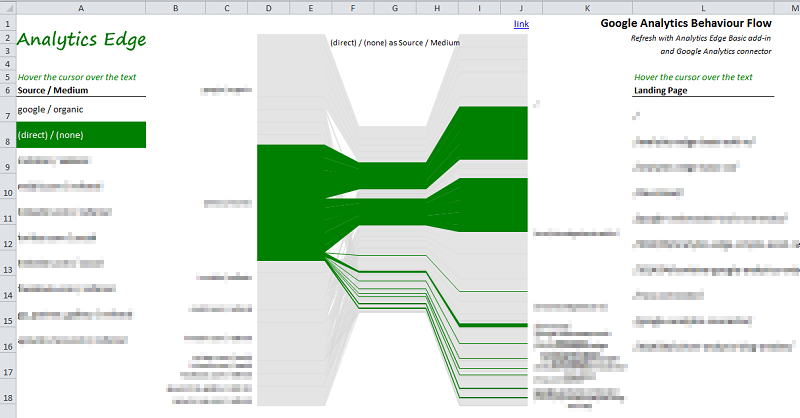
 Cosmographs have been around since at least 1939, and they show how a set of items splits into sub-groups. Google used a version of them in the Behaviour Flow diagrams they use, and I always liked them. In case you didn’t notice, you can click on one of the starting groups and select to highlight traffic through the chart from that source. Visually powerful!
In the source article, the guys provide a somewhat working example of a flow diagram, but it is very heavy in formulas and advanced Excel techniques. In a somewhat uncharacteristic move for me, I have layered yet more formulas on top of it to enable the chart to be used with Google Analytics data from the Analytics Edge Simply Free tools.
The result: an interactive behaviour flow chart showing how the top 10 sources for your website map to the top 10 landing pages. The workbook uses a mouse rollover, or interactive hyperlink technique so you simply move the cursor over the text in the left (source/medium) or right (landing page) columns and the display will highlight the traffic from/to the selected item.
Adding the Google Analytics Data
After looking at the sample provided, I quickly realized I didn’t want to mess with the thousands of formulas spread across 5 worksheets. My objective was to clean it up and get it working with some Source-Landing Page data. Their visualization is based on a table of data, so my first challenge was to populate that table with my data without breaking all the formula references.
I wanted the top 10 Sources and the top 10 Landing Pages, and I while there may be some Excel wizardry that can produce an Excel pivot table like I want, dropping it into the worksheet without breaking all the formulas was highly unlikely. I took a different approach: I made three queries using Analytics Edge: the first was the Source/Medium, Landing Page, and Sessions data for my site; the second was the top 10 Source/Mediums by Sessions, and the third was the top 10 Landing Pages by Sessions.
 Getting the top 10 reports is simply sorting the queries by Sessions and restricting the output to only 10 rows.
The big query with everything may give you problems if your site is really busy and has lots of unique pages and/or sources. In that case, you can sort descending Sessions and cap the query to 10,000 rows to limit all the little stuff. Since we are only interested in the top 10 of each, it is very likely all the meaningful combinations of the two will appear in the first 10,000 rows.
The next thing I did was to create a typical Excel pivot table of the big query results, pivoting the landing pages to the columns and the sources to the rows with the sum of sessions in the cells. The pivot table is BIG, but it should contain the combinations we are interested in. The next challenge is to get the specific combinations of the top source and the top landing page to appear in the target table. For that, I used Excel’s GETPIVOTTABLE function.
=GETPIVOTDATA("Sessions",QueryResults!$E$13,$B$6,$B7,$C$5,D$6)
 I grabbed the row and column labels from my top 10 queries, then grabbed each of the table cell values using the GETPIVOTTABLE function. That allowed me to lookup the #1 source and #1 landing page from the pivot table and place it in the correct position in the target table. Since I was just changing the formulas in the table cells, all the other worksheet formulas referencing them were unaffected, and they simply used the new values.
Not So Smooth
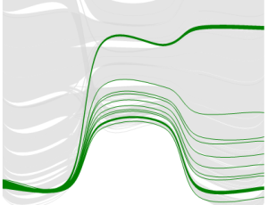 Next on the list of modifications was to turn off the smoothing they applied to the curves in the chart. Excel’s smoothing algorithm has a side effect that is overshoots the original point, and I found that distracting, so I turned it off.
You do that by selecting the chart, then from the Chart Tools-Layout ribbon, pick the Series “all”, and Format Selection to open the format dialog. On the Line Style section, uncheck Smoothed line. Repeat for the Series “my_selection”.
Adding Space For a Logo
I like my reports to have space at the top for a logo and a description of some kind, but the original worksheet packed everything to the top of the sheet. Inserting a few rows caused some problems with the formulas…sigh. It ended up being a simple fix, but took a while to figure it out.
=IF(ROW(A1)>ROWS(label_x),"",IF(AND(ROW(A1)=my_x...
The left and right listings used a technique of indexing based on the row number, and by inserting rows at the top, the indexes were thrown off. I had to change them to start at ROW(A1) again, and then the mouse rollover worked properly. The background highlighting was still out of sync, though.
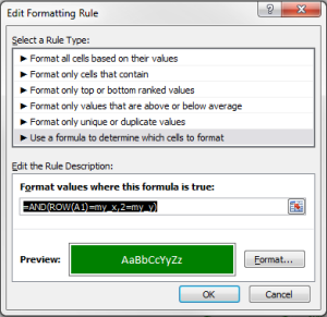 It turns out they use Conditional Formatting to get that background highlighting effect, so I had to edit the Conditional Formatting Rules and perform a similar re-alignment back to ROW(A1).
=AND(ROW(A1)=my_x,2=my_y)
Now everything highlights as it should! Keep that in mind if you want a little more space…
I also moved a handful of cells from the worksheet with the chart on it to one of the other worksheets. I find it is just a bad idea to expose configuration or intermediate cells to the user on the report worksheet.
Purging Excess Formulas
The original worksheet could handle a table about 20 x 20 in size, and I was intentionally restricting it to 10 x 10. Since that translates to 4 times more formulas that must be recalculated as you move the mouse around, I took a big dive into spreadsheet hell and purged the non-essential formulas form the workbook.
If you want to get them back, you’ll have to learned about the magic and mysteries of array formulas in Excel (Step1 worksheet).
Also, depending on the settings of line n_mult cell and the one immediately below it, you can affect the number of lines and gap between item groups in the chart. That, in turn must be supported by enough rows on sheets Step2 and Step3. You have been warned.
Modification Possibilities
So many things could be done with this visualization…but the easiest is to change the dimensions for the Analytics Edge queries. You can map pretty much anything to anything, and it would be done without affecting any of the formulas, so you could be done in a minute.
If you are a real glutton for punishment, you could try creating a conversion funnel with the technique. There comes a point, though, where you have to ask yourself whether Excel is the right tool for this type of visualization?
For now, this little bit works, and it’s free. Enjoy!