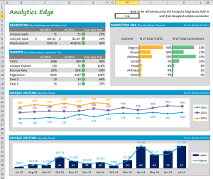
 This article describes the steps I went through to build a working prototype; it is light on process and documentation because this is an educational article, not a technical how-to article.
I enjoyed reading an article from Erin Simmons of Delphic Digital about building a digital marketing dashboard template, and thought it would be a nice example to show how you can automate a Google Analytics report in Excel using Analytics Edge products.
Included below:
- determine what data you will need and how you’ll get it
- optimize your queries to reduce duplication and speed up refreshes
- layout your dashboard on a grid using Excel rows and columns
- an example that shows the actual queries and techniques used
Any new report starts with an idea or concept, and then morphs slightly based on the available data, and results in a mock-up or sketch. Sometimes you need to start collecting new data (like defining a new goal). Sometimes what you actually have is not what you wanted; you may need to make a compromise while trying to maintain the purpose of the report.
Remember that reports should support some kind of decision making, or they are a waste of everyone’s time.
In most of my free reports, I tend to focus on generic measures and techniques that would apply to a wide audience, but you are encouraged to customize the queries to suit your unique business needs. Use metrics that matter to your business.
The Report Definition
I am going to create something similar to Ms. Simmons’ Website Marketing Dashboard, which shows a last-month vs last-year comparison of selected website measures, plus a couple of monthly trend curves. I will assume that “leads” are tracked as Google Analytics goal #1, and that you have similar goal #2 and goal #3 metrics of interest.
Queries. For each report element, we need to determine the actual data behind the presentation, and make sure we have it all available. I usually go through the report and write up a quick list of the queries needed. For this report, I make an assumption that “media spend” is AdWords cost, so I this would be my list of queries needed:
- Key events, current month and previous year, calculate year-over-year
- Cost per conversion, current month and previous year, calculate year-over-year
- AdWords cost, current month and previous year, calculate year-over-year
- Sessions and conversions by medium, current month
- Selected website metrics, current month and previous year, calculate year-over-year
- Users by month for the past 2 calendar years plus this year-to-date
- Conversions and spend by month for the past 13 months
Optimization. I scan the list of queries for any duplication or places where the queries may need to be built in a particular way for better refresh performance. In this report, the queries are all unique, but I can see a couple of long-term trend queries that may result in Google Analytics data sampling problems if not handled properly. Analytics Edge has a feature to minimize sampling that will help significantly here.
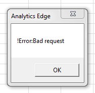 I do notice that there are a number of metrics being captured for the current month and previous year, and these can probably be combined into a single query. There is a limit of 10 metrics per query, but not all metrics can be queried in combination, so build your query and try them; if you get an error, remove some of the metrics to find which ones aren’t compatible, and make multiple queries to get what you need. Note: although Google supplies a Valid Combinations web page (the link is right on the Fields tab), the API doesn’t always work for all the combinations it should, so don’t be too surprised if good combinations fail.
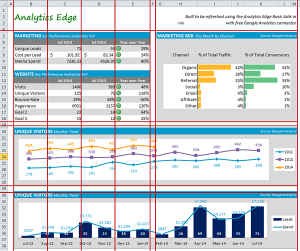 Layout. Before we start building queries, perform a layout review – remember that Excel is a spreadsheet tool that is restricted to rows and columns, and that columns are the same width all the way down the page and rows are the same height across the entire page, so you need to make the layout fit into those constraints. Another consideration is whether the page will need to be printable, which further restricts your design.
This report has a couple of tables of similar contents stacked one over the other, and the rest is charts, which provide great flexibility. One concern is that the original report appears to have a square overall shape, which is fine for desktop screen presentation but could be a problem for printing.
Building the Report
Use a Data Worksheet. This is the fun part – playing with the data (yup, geeky, I know)! You can download the workbook and follow along if you want. I created a Data worksheet and started building the queries needed. Some people prefer to place the queries right in the final report worksheet, but I find that approach forces you to have to consider layout at the same time you are trying to focus on whether you have the right numbers. Putting the queries on a separate worksheet allows you to concentrate on getting the data right and not get distracted by colours and fonts and alignment issues.
Get the data right before you play with the layout.
With the Analytics Edge Add-in, you could perform any needed calculations before the data is written to a worksheet, but the use of a Data worksheet lets us download the raw data and perform intermediate calculations in Excel. In this report, we will perform several calculations in Excel, such as the the year-over-year calculation.
The Analytics Edge Add-in allows you to place queries anywhere on the page, and it leaves a comment to hint at their location. In this workbook, I put a little reminder above each query for what that section was for. In some cases, it is a derived (intermediate) block of calculated cells.
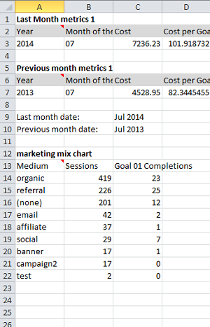 Documentation. Completely undocumented Excel reports with complicated formulas are known as spreadsheet hell…so try to avoid the worst by at least labelling the queries on the Data worksheet so you can keep track of which is which. Similar to software development, eighty percent of report development work will happen after the report is “finished” — changes made over the lifetime of the report, so leave a few breadcrumbs about where the numbers came from or what they are for. If you have ever ‘inherited’ someone else’s Excel workbook, you know what I am talking about.
You can put all your queries on a single worksheet, just make sure you keep some empty rows and columns around the query results so they won’t overlap or overwrite each other. If the query is open-ended, such as Page or Source listing where the number of rows could change, it is best to not put any queries below them. If the number of columns could vary over time, don’t put anything beside them. Don’t be afraid to use multiple worksheets — they actually are more efficiently handled by the add-in that way. In the end, you will probably hide all the data worksheets anyway.
Report Dates. Trick of the trade: I added a Year and Month dimension to the first couple of queries so I would have a couple of cells with the report year and month in them. I then use a little Vlookup formula to convert the month ‘number’ (07) into its equivalent (Jul). The Add-in has a Convert function that could do this for you.
Fixed Lists. In some reports, you want to have a fixed list of items, in a specific order; for example showing the mediums of Direct, Paid, Social, Referral, and Organic always in the same order. In this report, the marketing mix chart is one of these cases – a fixed list of items with some potentially being zero and a group of ‘other’ at the bottom.
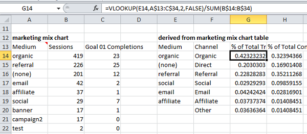
This can be easily handled with the Add-in’s Lookup function, but we will rely on Excel functionality, so we need to use the infamous Vlookup formula again. When you specify the ranges to lookup, make them large enough to allow for more rows to appear in future queries. Let Google search be your friend to help with the formula].
Note that this table is showing the percent of total traffic and percent of total conversions, so the calculation for the “other” category is simply 1–sum(all the others). If we weren’t using the percentage of total, we would use the sum(table column) – sum(all the others). It is not necessary to try to add up the individual other elements from the source data; just subtract your selected ones from the total.
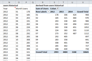 Pivot Tables. Sometimes you need a pivot table to turn columnar data, like a year-month-users query into a year-by-month tabular view. Again, when selecting the data ranges, make sure you allow for extra rows or columns in case the future queries return more results [the Analytics Edge wizard has a pivot function so you don’t have to deal with pivot table strangeness].
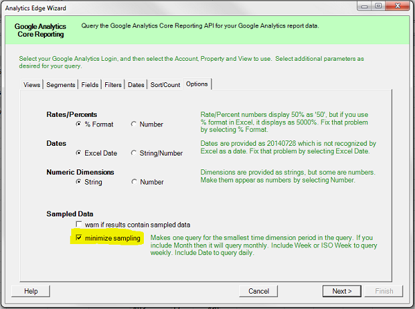
Long-Term Queries. If you are going to include any queries for long time periods, like 12-months, consider the possibility of getting sampled data from Google Analytics. If you are making these queries with a time dimension, like Month of Year in this case, then use the Analytics Edge option to minimize sampling. It may slow down your refreshes a bit, but it will deliver the most accurate results.
Make it Pretty
Got the data! Now the challenge is to make the presentation look a little bit like the sketch you drew. Depending on the version of Excel you have, there are plenty of quick-and-easy visualization tips you can follow — and this is where I started off. Other resources you can fall back on include Microsoft’s own tutorials for Excel, websites like Chandoo.org or Perceptual Edge, and courses for building dashboards.
A few general points:
- don’t spend a lot of time trying to get it perfect: good reports lead to decisions, and decisions affect what is needed in the report. Reports will change.
- you don’t need to be creative: copy someone else’s work! Use Google image search for ideas.
Some things specific to Google Analytics data and Analytics Edge products to be aware of:
- try to keep complicated formulas only on the Data worksheet. Use simple cell references from the Report worksheet to get the data from those intermediate cells on the Data sheet.
- when using conditional formatting, remember that some metrics like Bounce Rate are worse when higher, so don’t blindly apply green to larger numbers.
- if you want to represent time on page/site in minutes and seconds, then divide the number from Google (seconds) by 86400 (the number of seconds in a day) [Analytics Edge has an option to do this division for you], and display with the format code mm:ss.
- if you build the report with a test website, try it with real data before you commit — bigger numbers usually don’t fit in narrow cells and no one wants to see a report of ‘########’ pageviews this month.
- remember that sometimes there is no data for the metric you are looking at. On the Report worksheet, you may want to include a formula to show empty cells instead of errors =if(iserror(Sheet1A1),””,Sheet1A1)
Tabular metrics. For this report, I made simple cell references to the Data worksheet for the various metrics and column labels (the pretty dates). For the year-over-year numbers, I used a simple formula right on the Report sheet. I also included a touch of custom formatting to get the red/green colour dots. Note that I manually set the thresholds to 0.1 and -0.1 so the green starts at +10% and the red starts at -10% change. For the mid-range, I chose to show no colour. Note that I reversed the red-green colours for the Bounce Rate because 100% bounce is usually bad, so an increasing bounce rate probably is bad as well!
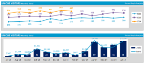 Charts. The first of the two bottom charts is made from the pivot table on the Data worksheet, then I changed the colours and added smoothing to display like the reference article describes. Then you get to hunt around the Excel interface to turn off all the helpful things they display for you automatically.
The lower chart is an example of where Excel can sometimes make you work hard to get what you want. The chart uses two vertical axes – a primary for the line and a secondary for the columns. That allows them both to auto-scale on different scales. The problem comes when you try to turn them off so they don’t appear — the secondary axis settings disappear and you get a single scale for both line and columns. The workaround is to leave them on, but set the Major and Minor tick mark types, as well as the Axis labels, to None. That way, it has two axes but nothing shows. The problem with this type of trick is that it may not work across all versions of Excel, so your report may look garbled on other people’s computers. Best to check it out.
Charts that Aren’t Charts. At first I thought the upper right block was a pair of bar charts, but after looking at it, I decided it would be better to make it using conditional formatting bars and a simple column of numbers. The data is actually in 5 columns, which are cell references to the Data worksheet, but I repeat each of the two columns of data.
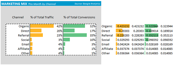
On the first of the two columns, I overlay a conditional formatting of solid fill data bars, and edit the rule and check the option to Show Bar Only. The second column I formatted as % and made narrower. To get the wide grey ‘axis’ I turned on a wide left border for that range of cells. The results looks like a charts, but aren’t.
You Can Do It, Be a Visionary!
You are probably thinking: there is no way I could ever do that by myself! Well, you don’t have to. I provide plenty of free reports and articles to get you going, plus there are lots of other great websites out there with helpful tips, tricks and how-to articles and videos. If you ask nicely, I might even help you out a bit. Analytics Edge and you; working together.