 This report combines branded and non-branded Google search results into a single table for easy comparison charting, pulling data from the Google Search Console API with Analytics Edge. It demonstrates how Analytics Edge makes multiple data transformations simple so you can quickly get the data in the format you want.
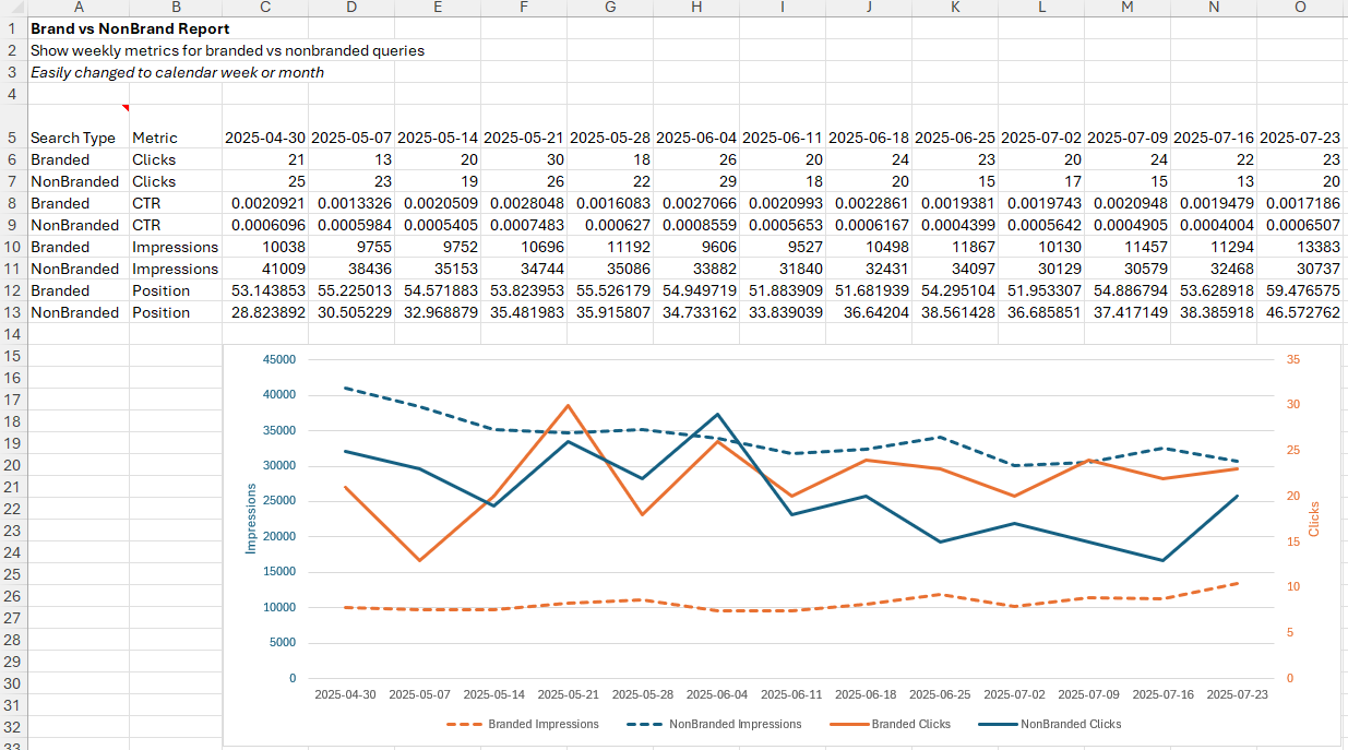
The report shows a weekly trend, but it could easily be changed to monthly or daily reporting. While it shows a comparison of branded searches vs non-branded searches, you could also use it to compare any other filter combinations.
Creating the report with Analytics Edge
Download the example workbook: coming soon…
The Macro
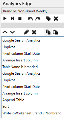 The Analytics Edge macro to create this report contains 2 queries, one for each search condition (branded vs non-branded). The queries use a multi-query by week to report the selected metrics weekly.
An Unpivot function is used to convert the four metric columns into four rows (for each date) with the metric name and value. The Pivot function then re-pivots the date to the columns, and Arrange is used to insert a label column (‘Search Type’) with an appropriate label for the filter. The first filter result is saved with a TableName function.
The process is repeated with a second query using a non-brand filter condition, and Append is used to append the two result sets together. That is Sorted before writing to the worksheet.
With just a few simple wizard functions, you can easily compare branded and non-branded queries. The same technique can be used to compare other filter combinations.
Analytics Edge gets it done in minutes.