Google Analytics uses statistical sampling to improve responsiveness for large queries. There is nothing wrong with statistical sampling — it will usually produce numbers close to the actual, but not always. It starts to display problems with long term trend charts typically shown in annual reports. The Analytics Edge connectors for Google Analytics include a feature that can dramatically reduce sampling errors in your Excel reports.
There Is (Almost) Nothing Wrong With Sampling
First of all, sampling is a tried and true technique. Sampling can be triggered in a query involving a lot of events and multiple dimensions, and the accuracy suffers. By itself, sampling really isn’t much of a problem. The numbers display an estimate of the traffic based on a statistical sample. If your query is simple, you get a pretty good estimate.
Problems arise when your query isn’t simple: if you include more than 1 dimension in your query — Google’s algorithms tend to flatten the curves. This is especially visible when you create long-term trend reports. At the start of a year, you see a lot of sampling in annual website reports. If you have traffic that is very dynamic, with peaks and valleys from month-to-month, you will see that sampled reports tend to level-off those peaks and valleys. In the worst case, you may see a flat line over the whole report, which is simply misleading.
Ecommerce and key event details can be seriously misstated if any sampling kicks in, because the report will only show details for hits that were included in the sample. No level of sampling is acceptable for these detailed reports.
Little Bites
To reduce sampling error, the easiest method is to use a shorter time period. Making 12 monthly queries is the direct approach, especially since you want to report monthly values in your trend chart anyways.
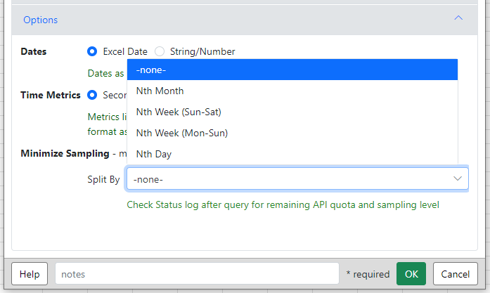
 The Analytics Edge connectors for Google Analytics includes a dropdown on the Options tab that does this automatically for you. When you refresh the query, it will break the time period of the query into days, weeks or months, run separate queries for each period, and join the results together. Even on very high traffic sites, you should never get a flat trend line because each period is sampled independently.
Ultimate Accuracy
If you are not interested in a trend but need the absolute most accurate total possible, then include the Nth Day option in your query. Separate queries will be run for each day in the date range, providing the most accurate numbers available.
Note that the Analytics Edge Add-in can remove the Nth Day column (using the Arrange function), combine the duplicate rows (using the Duplciates function) — this is what simple Excel report automation is all about. CAUTION: do not combine averages or rate metrics since the sum of the averages is a meaningless measure. Instead, you should include the components of the average in your query (e.g. engagement rate is engaged sessions / sessions) and use Analytics Edge to calculate the new average (sum of engaged sessions / sum of sessions).